Signature requests
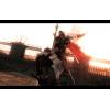
I like the second one, like he's slipping back into the shadows.
I like the second one, like he's slipping back into the shadows.
Same here.
Really, this one?

I need Red's opinion on this. xD. The common non-aesthetic-ally oriented person doesn't know wuts right.
True enough, Art was one of my worst subjects at school.
One of my best 
I like #3, the focal needs to be the focus of your attention, you can't have it faded and non-distinct 
Would you mind telling me how you did the text? I like it a lot!
One suggestion I have is that the motion bllur should continue on the right side of the sig as well 
With teh text, i suggest you just make some 180 degree cuts into the text with eraser; its a filter in GIMP thats not available in photoshop. After you do the cuts, just duplicate the layer, gausian blur , put the first layer over the new one, make the first layer into screen, and set its opacity down to whatever you like.
Other than that, i really hate the #3 one since i messed up on it. I think i'll keep the #2d one.
If you don't like #3, go with #1, it's the next best 
and thanks for the text tip 
Are you guys still making sigs? If so I will be placing an order in a day or two (I just have to find a reference pic). If not.... I will just figure something good to shove in my sig.
Yeah, I'll make one for you 
After several ideas, I have settled on the following. Feel free you make it your own and adjust it however you think will make it look best. I am merely giving a scenario and some ideas, but I want you to ultimately decide what to fit and what not to.
When a guard is killed, he falls, sprawled on the ground. Then the next Venetian guard patrol comes by and stops, the Seeker usually kneeling beside the body with the butt of his spear on the ground, and the other guards usually start to harass what remains of the crowd that hasn't already fled.
I would like a signature that reflects this moment of the guards stumbling upon one of their own, dead, and beginning to seek out the culprit, with Ezio either looking on or moving in for his next victim, or an implication of such.
Again, I trust your artistic vision, so don't feel constrained by my ideas above. Feel free to elaborate or simplify as necessary.
Thanks. 


Edit in regard to Draco's comment:
I would like the coloration to be slightly flatter than in-game, like an oil painting of the moment, time of day makes no difference to me; if this is too difficult, a wash-out color effect of silver with other colors that accent the scene would be nice.
I would like a Venice locale (mainly because I want a Seeker in the scene, and Seekers are more common there).
Sounds interesting... it would be helpful even more if you gave a few colors. basically open up paint, and chose some colors on the spectrum if you're really picky 

Sounds interesting... it would be helpful even more if you gave a few colors. basically open up paint, and chose some colors on the spectrum if you're really picky
Vaguely picky, so I went ahead and edited my previous post to give a better impression of what I want. If it looks good, I can forgive any color choice, really. 
Like, I even like the neon pink in your signature. despite the fact I usually hate neon pink.
Hmmm, that'll require some drawing skills and technology, I very much doubt that that specific image is available on the web.
Do you have a Wacom or something, Draco? If so, go ahead and do this one, because I don't (yet).
No... this may take a shit load of work. I'll do it on the weekend.
I'm tempted to draw that for fun. 
I understand that it may be extremely overwhelming. Like I said previously, you can scale it down however much is needed to make it look nice. I believe I have seen pieces similar to what I want in videos on the site. I don't have time now, but tomorrow I can find a still-shot similar to what I am wanting, and I can post that link and time.
References:
http://www.youtube.com/user/DracoX872#p/a/u/0/kodx9iEjBOM 5:54-6:00 is a vague shot. 8:50 is a close shot of the guards looking at a body (to the left).
http://www.thehiddenblade.com/complex-stunts at approx. 7:10 is an example of the guard layout.
I can take some in-game screenshots and post it online (I have AC2 for PC). I just have to figure out what website to post it to to send you a link for.
---Tried, but printscreen won't capture the image. West side of Florence near the haystacks is a good area to see a Seeker kneeling by a body.
Unfortunately, stills from 480p videos don't provide enough quality to be of any use when using them from graphic design :/
However, if Joey draws it for you, I can color it and make it into a sig 
Yeah Joeeyyy!!
Hey, if possible, I'd like a sig of Desmond, Lucy, Shawn and Rebecca all side by side, with an Animus glitch (either from AC1 or 2, doesn't matter) across the left side of the sig.
I know it's probably really hard, so if it can't be done, I'll think up something else.
I love your name. Lol Zoup.
Are you guys talking to me? Sorry, my laptop has had some serious issues the past couple of weeks, so I missed most of these threads. I'm still gonna draw this! Don't worry! 


 Now he notices
Are you guys talking to me? Sorry, my laptop has had some serious issues the past couple of weeks, so I missed most of these threads. I'm still gonna draw this! Don't worry!
I look forward to seeing it. I don't have a time limit or anything I want it by.
Well I'd like to do it soon, so I'll see how fast I can get it done and uploaded. 
Hey guys, just checking to see if I can get any sig.. just anything that you guys think looks cool.
You know, so I'm not left out and stuff.
Awaiting reply eagerly 
How is it coming along, Joey? Did I make it too complex for my own good?
Cause I know nothing about art I'm gonna leave this roughly up to you guys but can you make a signature for me with a picture of Ezio walking past guards who are falling over having just been killed by an arrow storm?
If you could make something around that, it would be really cool, do have time to do that for me? 
How is it coming along, Joey? Did I make it too complex for my own good?
Hey shut up! lol
No, college has just really drained me. I haven't even been able to do anything for fun anymore. My final projects are this week, so I'll see what I can do over Christmas break. I've planned on playing ACB with a few of the members here, though, so that'll take up much of that time, too. 
Jfighter777 wrote:
How is it coming along, Joey? Did I make it too complex for my own good?Hey shut up! lol
No, college has just really drained me. I haven't even been able to do anything for fun anymore. My final projects are this week, so I'll see what I can do over Christmas break. I've planned on playing ACB with a few of the members here, though, so that'll take up much of that time, too.
No problem, I understand. College is draining. Feel free to play ACB, just making sure you hadn't forgotten about me. 
Actually I've been trying to work that into an art project for class, but nothing really fits it. So I've been thinking of it the whole time. XD
Is anyone willing to make me a custom signature? I'd like one for my university course (mainly for a student forum I'm a member of rather than here) and was wondering if anyone could do it? 
Is anyone willing to make me a custom signature? I'd like one for my university course (mainly for a student forum I'm a member of rather than here) and was wondering if anyone could do it?
I see you got something figured out. 
PatrickDeneny wrote:
Is anyone willing to make me a custom signature? I'd like one for my university course (mainly for a student forum I'm a member of rather than here) and was wondering if anyone could do it?I see you got something figured out.
Indeed! It's pretty simple as I only have Paint but I didn't want it to be too complicated anyway. I'm actually quite happy with how it looks and I think it has everything I want in it. 
Struttin' that sig, Patrick! You rock.
Struttin' that sig, Patrick! You rock.
Aha, thanks Mom! 
The only thing that annoys me about it is that some of the letters on 'The University of York' have become skewed because I increased the size of the logo ever so slightly and it seems the pixel pattern of the lettering couldn't quite handle it. It's barely noticeable and I decided to fix it on a couple of the letters when I thought it was just one or two. Once I realised it was most of them I gave up. 
Struttin' that sig, Patrick! You rock.
Aha, thanks Mom! 
The only thing that annoys me about it is that some of the letters on 'The University of York' have become skewed because I increased the size of the logo ever so slightly and it seems the pixel pattern of the lettering couldn't quite handle it. It's barely noticeable and I decided to fix it on a couple of the letters when I thought it was just one or two. Once I realised it was most of them I gave up. 
here you go, Patrick...
no letter resize problems... haha

here you go, Patrick...no letter resize problems... haha
That looks great, thanks!  Could I be a massive pain and ask if it's possible to have the colour changed to more like the green I used? It's just that it's the official university green and I'm very pedantic. The university font (for the course name) is Palatino too. I don't know if the course name and date would look better centred, although that may cover the emblem too much. Now I'm just being really picky.
It looks great as it is though. Thank you. 
hehe...
I, too, am very particular about these things... 
The font I used was Palatino.
The color I used was from the official University Visual Identity guide, here >> http://www.york.ac.uk/communications/publications/visual-identity/colours/
HEX 18453B
In addition, I was sure to leave proper buffers around the logo, as dictated here >> http://www.york.ac.uk/communications/publications/visual-identity/logo/
I'm willing to change whatever you want though. 
Patrick, you ungrateful little...
KIDDING!
hehe...I, too, am very particular about these things...

The font I used was Palatino.
The color I used was from the official University Visual Identity guide, here >> http://www.york.ac.uk/communications/publications/visual-identity/colours/
HEX 18453B
In addition, I was sure to leave proper buffers around the logo, as dictated here >> http://www.york.ac.uk/communications/publications/visual-identity/logo/
I'm willing to change whatever you want though.
Ah, I see! Yeah, I looked up all the logo usage rules and official guidelines when I made mine and chose to ignore most of them. I just used the colour select tool on Paint to match the colour on the top banner - obviously it wasn't very accurate!  I'm impressed you adhered to the 'U'-sized border rule around the UoY logo which, again, I looked up but then ignored.
In that case, leave it as it is. It's grown on me now and looks better than anything I could do. I particularly like the watermark logo in the background. Thanks again! 
- « first
- ‹ previous
- 1
- 2
- 3

