Artwork needed


The Hidden Blade could use some better art. The current logo was something a friend whipped up for me at the last minute and I appreciate his effort.
We have some talented digital artists as members here (I'm looking in your direction, Heart). Would any of you volunteer to design a new logo? The theme calls for an icon 64 pixels wide by 73 pixels tall. Preferred format is PNG with an alpha channel, so the background color shows through. If you have an idea for a whole banner with good site branding, I'm open to redesigning the theme to accommodate.
Ian's idea for a logo was a nice image which, upon closer examination, has a blade hidden in it. Use this topic to share your ideas and/or artwork! 


well im no artist but just wanna say good luck guys 

i could help ya out i draw ac alot so i would be cool drawing for this site

Whoa, I didn't even know this was asked for! 

I felt like doing something, so I just whipped up this. It doesn't fit the size requirements, though.

Nice!
I was just thinking of a simpler design for a logo. A hand is outstretched as the hidden blade is unsheathed (what Ezio does to keep his hands out of the way of his blades, unlike Altair, who lets it pass through his lack of a finger). It would be pointing to the top right corner of the logo. I thought it would be better to be original, rather than taking Assassin's Creed symbols. I know that this site is 90% Assassin's Creed, but we're not ignorant to other games. It's a subtle idea.
Hopefully I'll be able to sketch out an idea and show it to you guys next week (new laptop?).
18 months later... this topic comes to life! Thanks for offering to help, guys. I will watch for for further developments.
Hey stab, this topic was created right before I joined, and it wasn't commented on...so...so meh! 
We'll keep thinking of more designs, though. 

18 months later... this topic comes to life!
Nice idea, Joey. Do you think it ought to be drawn?

I was just thinking of a simpler design for a logo. A hand is outstretched as the hidden blade is unsheathed (what Ezio does to keep his hands out of the way of his blades, unlike Altair, who lets it pass through his lack of a finger)
I like the idea and I also like the idea of the hand having a finger missing. Does that make me weird? 
Or maybe just show the finger bent down like Lucy did. Yeah, that's less weird. Whew.
I like the idea and I also like the idea of the hand having a finger missing. Does that make me weird?Or maybe just show the finger bent down like Lucy did. Yeah, that's less weird. Whew.
So, the same idea I had, but without a finger, or a fist with the blade coming through like Altair does? I'll whip up some variations this weekend, then try to post them. 
Drew them out (finally). If I can find a camera or get my phone's photo app to work again, I'll post them asap.

http://vesferatu.deviantart.com/#/d3kik59
Can this be the next logo for your website?
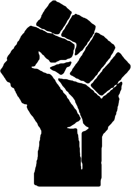
Hey, that's pretty good, Vesferatu! It meets many of my criteria for a site logo: size, transparent background, simple, and does not contain any Ubisoft trademarks. One thing that concerns me is the similarity to the Communist fist logo. Perhaps changing the color of the hand to something other than red would fix it.
Did you sign up to THB just to contribute a logo? We suddenly have much interest in the artwork for this site. Yours is already a strong contender. Thank you.

Agreed its a very nice logo.
The hand is very similar to, if not exactly the same as, the Communist fist/power salute but its still pretty cool as a logo. I personally like the red (it fits with the hints of red throughout the AC series) but I can see the problem of us being seen as a Communist site
A possibility would be a black hand with a red blade i.e. the colours inverted but the hand may then still resemble the black power salute What about the red hand of Ulster - a slightly less controversial symbol with a nice little myth behind it...?

salute for mother Russia
I haven't seen the "communist Assassin" pic yet (my phone won't show very many types of pictures), but it's probably better than my designs. I'll still post mine up so we have other choices. Other people: get in on this!
http://digitalart.org/images/artwork/0060000-60094/game-art/assassins-cr...
to me it would be great. all you need is the hidden blade written on the right side of altair
Do you need to have an account or something to see that picture? For me the link redirects here.
Anyway, it sounds like you're talking about a picture of Altaïr. We need to take care that our logo doesn't infringe on any Ubisoft trademarks.
http://3.bp.blogspot.com/__D5X3wjrPzk/R_ZIES7Z11I/AAAAAAAAWAM/E8NIDhG3iQ...
hope this one stays up
http://vesferatu.deviantart.com/gallery/31143811
I hope you like the improvements I made. Details are in the description if you click on the logo itself.
And yes, I did sign up for the sole purpose just to make a logo. I discovered your website 2 years ago, and ever since then, I've been hooked by your impressive game-play and your ability to think like an assassin.

version 2 looks like Vader's hand wielding a lightsaber
(now you cannot unsee)
I'd like to give it a shot, thou I'd like to have more info about what do you want as a logo, been doing some logo's recently, besides if you need a picture to use as a header I can take care of that in my free time, I've been wanting to do a fanart piece about assassins creed lately.
Here's a log and an illustration I did for an arcade cabinet =)
http://dark-razvan.deviantart.com/gallery/28379904#/d37pq8b
So yeah if I can get more info about what do you want for the logo, I can come up with better solutions.
Btw, sorry for my crappy english, it isn't my first language DX
http://vesferatu.deviantart.com/gallery/31143811I hope you like the improvements I made. Details are in the description if you click on the logo itself.
And yes, I did sign up for the sole purpose just to make a logo. I discovered your website 2 years ago, and ever since then, I've been hooked by your impressive game-play and your ability to think like an assassin.
I, personally, absolutely love that logo, Vesferatu! I didn't notice the lower part of THB on the first design but the new version with the black hand and red blade makes it more clear. I like how the main blade is red so appears to be covered in blood but the lower section is silver-grey. Lovely design.
http://vesferatu.deviantart.com/gallery/31143811I hope you like the improvements I made. Details are in the description if you click on the logo itself.
And yes, I did sign up for the sole purpose just to make a logo. I discovered your website 2 years ago, and ever since then, I've been hooked by your impressive game-play and your ability to think like an assassin.
nice very simple and i like it
I'd like to have more info about what do you want as a logo
The two main ideas we've thrown around are a blade or an eagle. Ian thought it would be cool if the blade was incorporated into a design such that it was only visible upon close inspection - hidden in plain sight. If you decide to do an eagle, please don't make it a bald eagle. I believe the eagle in the AC1 intro is a booted eagle.
The main requirements are that it's small, clean, and free from trademark infringements. It should brand the site and still be recognizable when shrunken down to a favicon.
Did you see my logo?
Finally saw it just now.
Suggestion?:
I like the black handed one the best. I was wondering if having "THB" somewhere in it would be possible? Maybe "T" on the left side of the image, "B" on the right, and "H" at the top-center with the blade cutting through it.
If this takes away from it, then it's fine by itself. Just an idea.
P.S.: Screw my ideas. These had very similar themes to mine, but are executed much better. I'd vote for them.
http://vesferatu.deviantart.com/gallery/31143811
The third one is up!
i like all three because they are nice and simple but the eagle was a nice touch
That eagle looks cool bit I can't choose between that and the simpler number 2. Looking forward to design 4
Pretty cool but too ninja-like for this site, IMO. Don't get me wrong, it's nice but I don't think he looks like an Assassin. I definitely prefer the blade-based designs
why not ezio with the hidden blade´s in front of him but everything is black like a shadow but the blade´s are red or white
The problem is we can't use Ezio as he's a copyright-protected Ubisoft-owned character.
Welcome to THB, Vesferatu! I think it's really cool that you joined just to design the logo.
I really like your version 3, the one with the eagle. Really nice.
I need feedback, Stabguy!
My favorites so far are #2 and #4.
I'm still concerned about the similarity to the "raised fist" logo. Black is the alternate color of the communist symbol. The blade pointing straight up could be mistaken for an obelisk such as the Washington Monument (or some other phallic symbol ). Could you rotate the whole thing clockwise about 135 degrees so that the blade points to 4:30 instead of 12:00? That would put the blade at the angle of Altaïr checking it.
Version 4 has potential. I like the concept and the blade is somewhat hidden in the distant left hand. The upper body is in classic air to assassinate form. The part that doesn't feel right is the position of the legs. Maybe that's what an Assassin's legs would look like under the robes. I never really thought about it. What I'd expect would be like a volleyball player going for a spike - with both legs bent in the same direction.
To the rest of you artists: get off your duffs! Vesferatu has already made four designs. Everybody else combined: zero.
Vesferatu wrote:
I need feedback, Stabguy!My favorites so far are #2 and #4.
I'm still concerned about the similarity to the "raised fist" logo. Black is the alternate color of the communist symbol. The blade pointing straight up could be mistaken for an obelisk such as the Washington Monument (or some other phallic symbol
Version 4 has potential. I like the concept and the blade is somewhat hidden in the distant left hand. The upper body is in classic air to assassinate form. The part that doesn't feel right is the position of the legs. Maybe that's what an Assassin's legs would look like under the robes. I never really thought about it. What I'd expect would be like a volleyball player going for a spike - with both legs bent in the same direction.
To the rest of you artists: get off your duffs! Vesferatu has already made four designs. Everybody else combined: zero.
I agree, but think the legs are fine the way they are. The Assassins literally tackle their target with the right hand and legs. In the position #4 is in, it's pretty accurate from what I've seen.
You know stab, for those of us that are working on other things at the moment and don't even have art software (ahem) it's difficult to get stuff up as quickly.
Besides, real art takes the longest, so that means anyone else working on these designs will blow your f*cking mind!!!
http://vesferatu.deviantart.com/gallery/31143811
There up. Feedback, please.
Oh, and I use Photoshop CS4 and Flash CS4. Just in case you're wondering.
I'm still in love with the air to assassinate image with the legs spread. The new one looks like the Assassin is saying "eehhh..." as he's leaping. Kind of lazy-looking with that position. That's my opinion, though.
Now that you have the black hand with a blade coming out, that goes back to my original ideas. In fact, it looks just like a couple I drew out the other week.
Those are my picks.
i like v6 v2 and the air assassination one
Wow. These are my new favorites. That might have something to do with the fact that they're being drawn to my specifications.
I see what Joey means about the legs in V6. What I had in mind was something with more potential energy like this:

V5 looks really good, as in good enough to install today. May I ask why this one has a frame and "venetian blind" background? It looks fine but we may need a simpler version for the tiny favicon.

Would a stance like this work ?

It is close to Stabguy's volleyball player posture, except he isn't going for the ball but has just hit it on the other side of the net.
I can see Stab's legs idea working if one leg was behind the character, just leaping from the ground, but the other leg is bent like the other designs.
http://vesferatu.deviantart.com/gallery/31143811
There is a frame in this one because it simply looks weird having an arm jut out of nowhere with a jagged edge to symbolize a corner cut. It just looks...weird - and has way too much space. The border fills up that very space, giving it depth. Also, a SEMI-TRANSPARENT "Venetian blind" was added for something extra - more texture.
However, if you are unsatisfied with such 2 things, I'll be more than happy to remove them for you. I'll even get started on the favicon.
As for the leg positioning, I'll have to redraw the leg position again. If I have to, I may have to create a different the same air assassination, but in a lightly more different angle. Only time will tell...
I really like the latest logo. Simple, indicative of the site, looks nice. Not too sure on the Venetian blinds, though.
i like them all except the last two

One thing that concerns me is the similarity to the Communist fist logo.
what's wrong with a little communis now and then? it makes everything 20% cooler
just incase it's not clear in textform, i'm not really serious, but still a little

Wow.
That was probably the funniest thing I've seen all day.